The complete DFU detection system aimed to develop through this project should be smart enough to be able to immediately classify a person under test as normal, (only) Diabetic, or someone with a high chance of being infected with DFU soon.
The Vertical Ground Reaction Force or vGRF data recorded from Controlled (non-diabetic) Subjects, normal Diabetic Subjects (Diabetic Patients with no history or present case of DFU) or Ulcer Subjects (DFU Patients or the Diabetic Patients with a history of Ulcer) need to be classified using Machine Learning (ML) for an immediate (real-time) response since their feature differences are not obvious in the human eye or cannot be differentiated using normal statistical analysis.
Moreover, the data extracted has some vital issues which prevent from applying direct comparison between them.
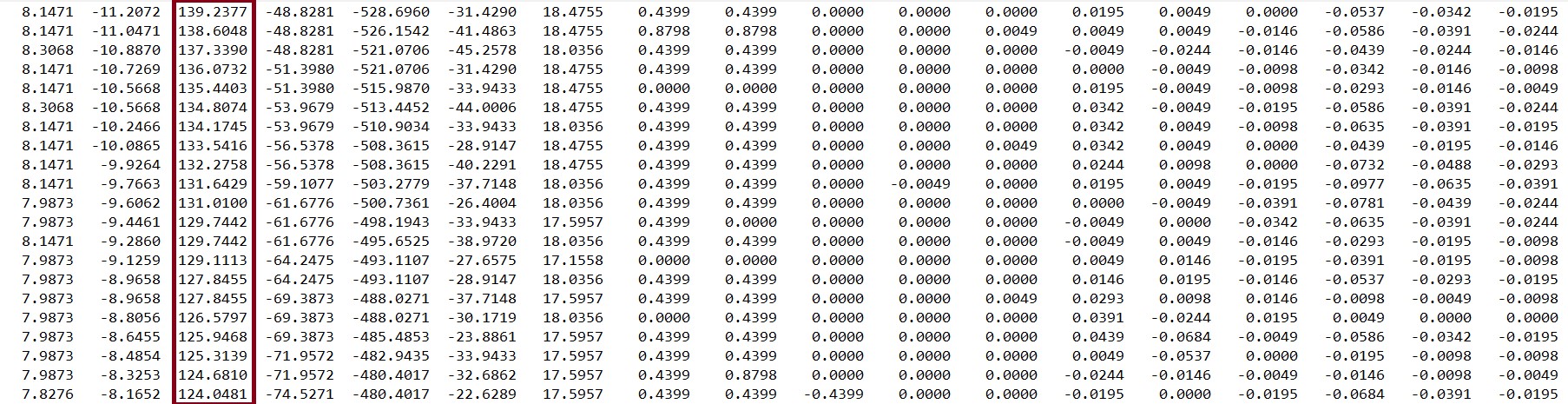
For this research, vGRF (and EMG) data had been collected from 76 subjects using the Force Plate method; 21 of them were Control, 21 Diabetic, and 34 Ulcer patients. The data was collected and saved in text (.txt) files along with EMG and other data. Each text file had several columns, and the third column consisted of the vGRF data, as shown in the figure below. There was a total of 76 files from 76 subjects.
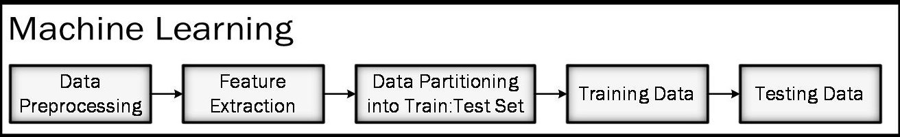
 Mentionable that the team was not able to acquire data as they could not finish the data acquisition system due to the COVID-19 crisis. Even if they were able to finish the Data Acquisition system, people willing to help in this regard during a time like this would be a thing close to impossible. So, the data gathered by a previous research group was used with permissions. Now, to analyze this data together, all the data from “.txt” files were combined using MATLAB and saved as the “.mat” format. Moreover, data from each class of patients were also saved in the “.mat” format, in terms of MATLAB arrays. The Machine Learning stages are shown in the figure below.
After the matrices were formed, they were plotted to visualize their characteristics. Plotting all the data from all patients in a single plot. Three separate clusters represent three separate classes of subjects. As can be seen from the plot in the figure below, there are three main issues about this combined vGRF plot, which need to be assessed before the Feature Extraction stage viz.
- The Data are not plotted in the same location along the Time Axis, and a major portion of the x-axis range is not being utilized.
- Plots (or data) are not horizontally fitting, i.e., they have different durations
- Plots are not vertically fitting as they have a varying magnitude
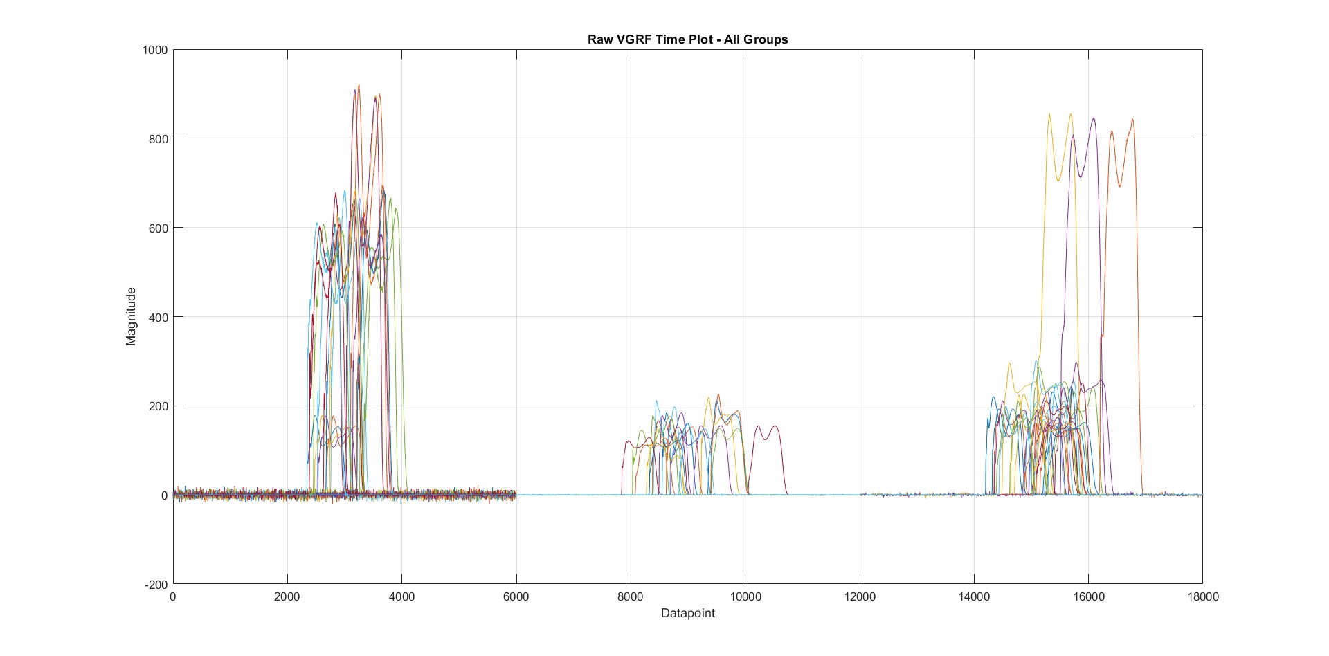
From raw collected data, this behavior is expected since every person walks at a specific pace, and the plantar pressure varies in each step. For that reason, the dataset is needed to be pre-processed before applying any ML process onto it. Data were segmented to have the same duration in the x-axis, and all data were normalized to stay in the same range (0 to 1). After plotting the same dataset after segmentation and normalization, we have the plot in the following figure:
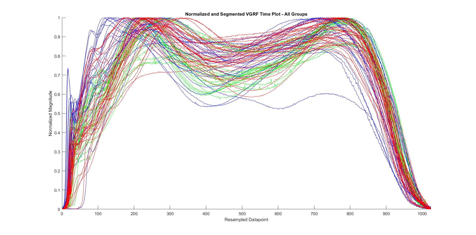 Note: The figure above shows the plots of segmented and normalized all subject data (Control – Green; Diabetic – Blue; Ulcer – Red)
After the data has been segmented and normalized, they can be utilized for Feature Extraction. Before that, the Segmented and Normalized plot for each class of data along with the mean – Standard Deviation plot of their respective classes have been plot separately within the same frame, as shown in the following figure:
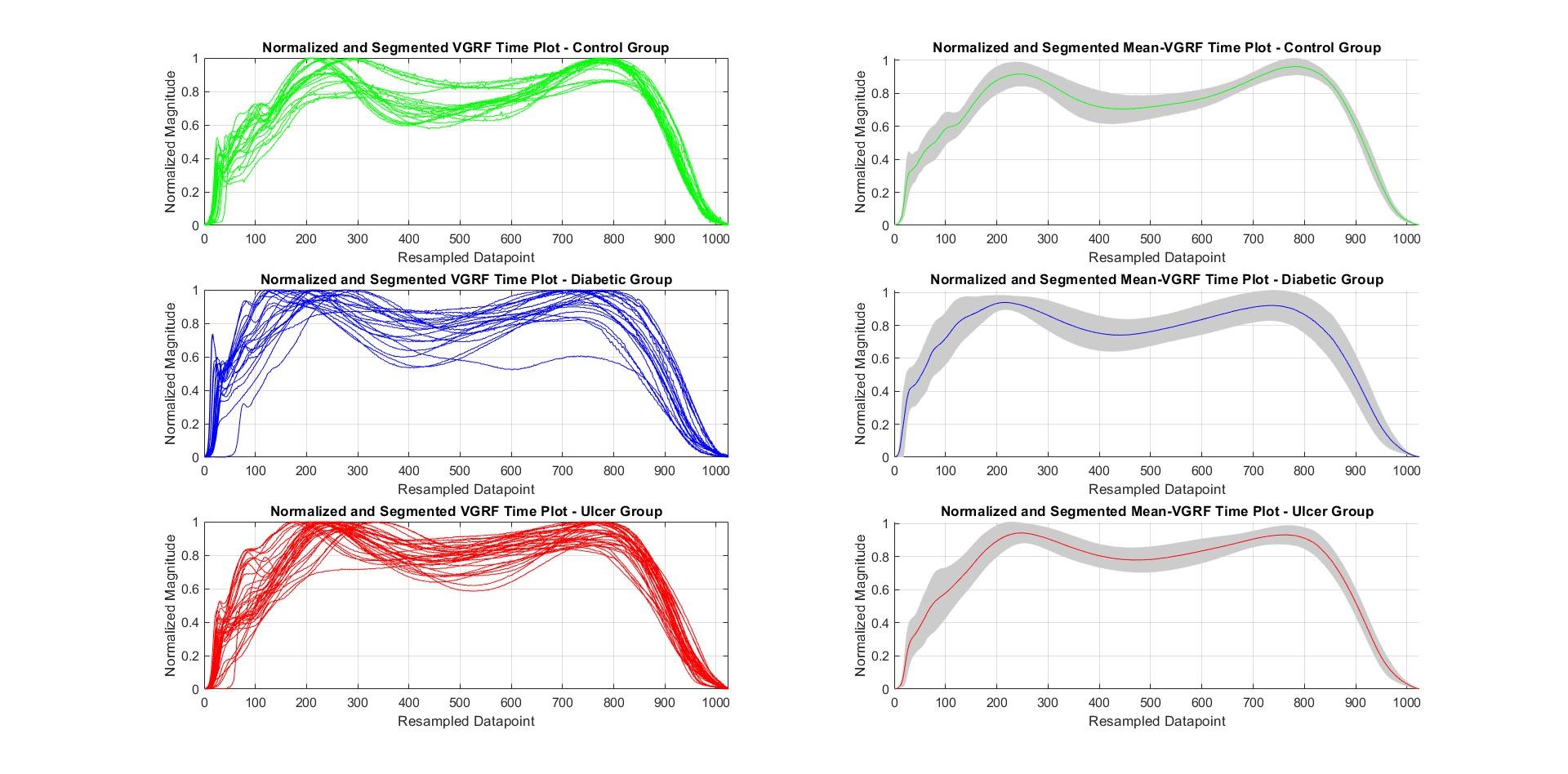 Note: the figure above shows the plots of segmented and normalized subject data per class (left) and Mean-SD vGRF plot per class (right) (Control – Green; Diabetic – Blue; Ulcer – Red)
The Standard Deviation or Variance of the data is shown as the grey shaded region around the mean throughout the data range. So far, all the plots have been drawn in the Time Domain.
The frequency-domain components will also be required for extracting features. Notably, combining all the vGRF data from all 76 text files formed a large matrix of (6000 x 76) where 6000 is data points per subject, and 76 denotes the subjects themselves. After segmentation (and normalization), the matrix reduced into (1024 x 76).
There was a huge number of null datapoints beforehand (due to the brief inactive time before and after the subject walked) along with a large amount of redundant data, which has been expurgated during segmentation and the whole dataset was normalized along the time axis (x-axis) from 0 to 1024 as shown in previous figures. This size reduction only left the dataset with necessary features for aiding feature extraction and shrugged off unnecessary data points. Now, to create the feature matrix, we needed two matrices namely “Signal” and “Fs” based on the following function,
function feature_matrix = featureExtraction(signal, fs)
The signal is the (1024 x 76) segmented matrix. As for the ‘fs,’ it is the segmentation frequency, which varies for each subject. It was seen previously from (Time vGRF Time Plot – All Groups), that signals for each subject have different duration in the time domain since people walk in various paces. Segmenting all of them to fall under a fixed time duration changes their walking frequency, which is a feature too important to ignore, at least in an ML-based approach. A (76×1) array was created based on the segmentation frequency of the subjects, which was input into the “Feature_matrix” function to create a Feature Matrix of size (76×33).
The Power Spectrum Density (PSD) plot and Mean-SD plot for the PSD for all subjects per class were plotted using the data from segmentation frequency, which were similar to the vGRF Plots shown in the following figure:
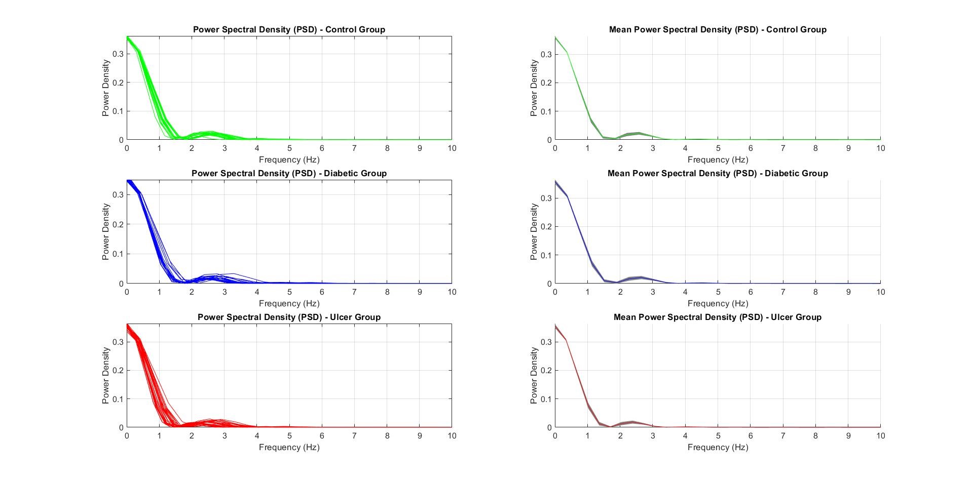 Note: the figure above shows the plots of Power Spectrum Density (PSD) per class (left) and Mean-SD PSD plot per class (right) (Control – Green; Diabetic – Blue; Ulcer – Red)
PSD was an important feature to be used in feature extraction and classification since the PSD along the frequency spectrum varies significantly with the subject classes. The DC values of the PSD has been cleverly ignored in the code since it just represented the ‘0’ readings from the vGRF. In the PSD curve, the Power Density in the 2nd bump, between 2-5 Hz of the plots shown in figure above, are the most important features to keep track of since it represented the walking frequency of the subject.